

Are you really doing Mobile-First Design?


As a returning web developer, I found several things changed since I took a pause from the field. I thought I had better look at the basic tools I used on a daily basis in my work before learning anything new.
When decided to jump back into the developer pool, one of the first things I did was an extensive review of CSS. The basics were basically the same, but the concept of "Mobile first" design was not something that was familiar to me.
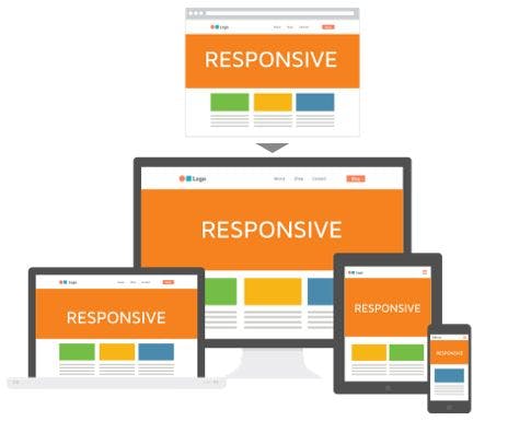
I quickly learned about writing media queries and started to make pages that were "responsive" using these. Once I began working on projects with other developing-developers, we were excited to produce sites that looked good on laptops, mobile phones, and tablets alike.
But we were not in fact doing mobile first design--we were doing the opposite. Our tendency was to start with a full-size version of the site and work our way down to mobile site. Okay, what is wrong with that?
Since most sites are viewed on mobile devices, it makes more sense to start designing for those and scale our way up to stationary devices. This is known as Progressive Advancement, and it's not just about the look of the site but its functionality.
If you start with the essential features and functions and build up from there, you start with a better user experience for your core audience. It's easier to add on than to take away, and as you design your mobile-first app it allows you to really focus on the usability of that app.
Would you ever want to design products that are not mobile-first designed? I suppose that could be the case if you were designing something for tablet-only or desktop-only.
However, according to research by Statistica:
"276.8 million people in the United States accessed the internet through any kind of mobile device. In 2023, this figure is projected to amount to over 287 million mobile internet users. Currently, approximately 83 percent of the U.S. population are mobile internet users."
That's a whole lot of users! Hence, it makes sense to understand what mobile-first development is, why it's important, and then try it out for yourself.
I did, and I must say that it felt strange at first but that yielded to a sense of relief when I saw how much easier it was to "scale up" to larger devices than it was to "scale down" to mobile.
I would love to hear your feedback!